
End-to-End Deep Learning Project
Using Blood Spectroscopy Data to Predict Levels of Cholesterol in the Blood


I’d like to start by apologising for the more technical nature of this post.
I usually try to avoid sharing technical content on Substack, but there are some non-technical insights here that I believe may still be valuable to a wider audience—I hope you find them useful.
This article is available in video format, if you prefer:
Project Overview
You can view and use the code and data in this project here: https://github.com/Mazen-ALG/data-science
A supplementary video is provided at the end of this article
1 - Project Background
What is blood spectroscopy, how does it work and what are its benefits?
2 - Setting things up
VS Code, Jupyter notebook and data source
3. Project Pipeline
3.1 - Project Background and Libraries
3.2 - Data Exploration (Using Pandas and Seaborn)
Assessing the distribution of our target variable
3.3 - Data Preprocessing (Using Sklearn)
Feature Selection
Standardisation and splitting of data
3.4 - Model Building (Using Tensorflow, Keras and Optuna)
Deep learning
Hyperparameter optimisation
3.5 - Model Evaluation and Interpretation (Using SHAP)
Model Accuracy
Confusion Matrix
4 - Thoughts and Reflections
1 - Project Background
Going into a data science project without much contextual knowledge can remove a layer of depth and excitement, so before I delve into this article I would like to give a brief introduction to the world of blood spectroscopy.
Blood spectroscopy studies how blood interacts with various wavelengths of light. This is done to analyse its composition and properties.
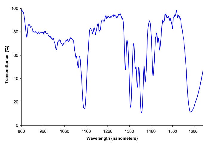
In the above image we see how varying the wavelength of light has resulted in different transmittance levels, which is the proportion of light that passes through a sample.
Different substances absorb different amounts of light at specific wavelengths, we can therefore use the patterns produced from blood spectroscopy to identify which substances exist in the blood.
Here are a few main types of blood spectroscopy
Raman Spectroscopy: A laser is shined on a blood sample and the scattered light is studied. Different molecules present in the blood cause unique patterns of scattered light, known as a fingerprint. Different blood components can be identified from raman spectroscopy such as glucose, which is important for managing diabetes.
Flourescence Spectroscopy: Blood is exposed to light causing certain components in the blood to emit (or “flouresce”) light back. The emitted light is analysed to identify and measure specific substances in the blood. If you came across a crime scene and wanted to figure out the age of a blood stain, flourescence spectroscopy can be used.
Infrared (IR) Spectroscopy: The absorption of infrared light by blood components are assessed, which provides information about molecular vibrations and the chemical bonds present. This is useful for detecting disease markers and understanding the molecular composition of blood.
In this article we focus on Near-Infrared (NIR) Spectroscopy which is a type of Infrared (IR) Spectroscopy that focusses on lower wavelengths (approximately 780nm to 2,500nm).
LDL Cholesterol is often referred to as “bad” cholesterol as high levels of this type of cholesterol can increase your risk of heart disease, stroke and other health problems.
2 - Setting things up
I would recommend running this project in Visual Studio (VS) Code together with Jupyter extension. This extension enables you to run blocks of code and see outputs directly in a notebook.
Visual Studio Code - Code Editing. Redefined
Visual Studio Code redefines AI-powered coding with GitHub Copilot for building and debugging modern web and cloud…
code.visualstudio.com
Jupyter - Visual Studio Marketplace
Extension for Visual Studio Code - Jupyter notebook support, interactive programming and computing that supports…
Data for this project can be extracted from: https://zindi.africa/competitions/bloodsai-blood-spectroscopy-classification-challenge/data
To gain access to the data you are required to make an account. This is quick and easy, so don’t worry! It also gives you access to entering future competitions.
Scroll down and download OriginaData.zip and extract the files to a desired location. For this project, we use just Train.csv as Test.csv does not contain our target feature. For clarity, I rename Train.csv to Blood_spectroscopy_ldl.csv.
Making a virtual environment
For this project we work with quite a few libraries (see next section). To avoid any conflicts we can make a virtual environment to install these libraries in.
A virtual environment is like a special tool box where you keep only the tools your project needs, so they don’t get mixed up with others!
To make a virtual environment, in our terminal we can write:
python -m venv deeplearning_env
Here I label our virtual environment “deep_learning”.
Next we activate it
For Windows:deeplearning_env\Scripts\activate
For macOS/Linux: source deeplearning_env/bin/activate
There are a few libraries we can then install in our virtual environment, used for this project:
pip install pandas seaborn matplotlib numpy scikit-learn tensorflow optuna imbalanced-learn shapWe go over, very briefly, each of these libraries in the next section
3 - Project Pipeline
3.1 - Project Background and Libraries
Objective
The objective for this project is to Develop a deep learning model on blood spectroscopy data to predict low, ok or high levels of LDL cholesterol.
Dataset
Spectral data from the Near Infra-Red (NIR) wavelengths ranges (950 nm to 1350 nm) extracted from Bloods.ai. contains 170 absorbance numbers, temperature and humidity at the time of the measurement and target features. 60-rapid fire scans per 486 individuals were taken resulting in 29,160 samples for analysis.
libraries
The first thing we do is import our libraries. Libraries can be thought of as pre-written code that are used for common computing tasks. Instead of having to draw a graph or build a machine learning model from scratch, we can use libraries.
Here, I would like to introduce you to some common data science libraries, all of which we use in this project:
To import these libraries in Python we can use the following code:
import pandas as pd
import seaborn as sns
import matplotlib.pyplot as plt
import numpy as np
import sklearn
import imblearn
import tensorflow as tf
import optuna
import shap
3.2 — Data Exploration (Using Pandas and Seaborn)
Before delving deep into building predictive models, it is important to get a feel of our data.
We first make use of the pandas read_csv() function and import our data into Python. Make sure you change the file path to where you store your data! Here we have stored our data (train.csv) under the folder “data”.
# Read data into Python
df = pd.read_csv('data\\train.csv')
To get a better feel of the data, we can view the first few rows by making use of the pandas .head() method.
df.head()From the above output we can see the various absorbance numbers, temperature and humidity but we also see a few target features (features that would be useful to predict). These are:
hdl_cholesterol_human (the level of HDL cholesterol)
cholesterol_ldl_human (the level of LDL cholesterol)
hemoglobin(hgb)_human (The level of hemoglobin)
Each target feature can take three values: low, ok or high.
In this project, we focus on predicting just the level of LDL cholesterol.
Next, let us take a look at the distribution of our target variable:
# Display counts of LDL cholestrol values
countplot = sns.countplot(x='cholesterol_ldl_human', data=df)
countplot.set_title('Distribution of LDL Cholesterol Levels')
countplot.set_xlabel('LDL Cholesterol Level')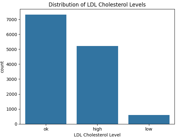
From the above graph we see quite clearly that the data is imbalanced. More specifically, the number of low LDL cholesterol cases are much lower.
Having imbalanced data can lead our model to be bias towards the majority class and lead to misleading evaluation metrics, such as accuracy.
You can imagine if we had 100 samples of apples and oranges, with 1 apple and 99 oranges — if our model predicted oranges for all samples we would have an accuracy of 99%! This may look amazing — but we didn’t manage to predict our only apple. Poor apple, being grouped together with the oranges ^^
There are several methods to deal with imbalanced data, some of which are described here: Solving Imbalanced Data. We address this in section 3.36 below — Dealing with Imbalanced Data.
3.3 Data Pre-processing
This is arguably the most important section of this project.
Build a model on nonsense data and we get nonsense results!
Remember the same pre-processing steps we apply to the training set must also be applied to the test set.
3.31 Label Encoding
Models work with numbers and not words, so for the first step, we are going to convert our target variable into numbers. Namely, map “low” to 0, “ok” to 1 and “high” to 2. This is what is known as label encoding.
# Encode LDL cholesterol levels
mapping = {'low': 0, 'ok': 1, 'high': 2}

# Apply the mapping to entire dataframe
df['cholesterol_ldl_encoded'] = df['cholesterol_ldl_human'].map(mapping)
3.32 Defining Input and Target Variables
For our model, we want to use as much useful information as possible to predict ldl cholesterol levels (our target variable). In particular, all informative absorbance values, humidity and temperature (our input variables).
# Select features with the word 'absorbance' in their name, humidity and temperature as input features
X = df.filter(regex='absorbance|humidity|temperature')

# Define target as cholesterol_ldl_encoded
y = df['cholesterol_ldl_encoded']
3.33 Split into training and test set
Since we are working with one big table of data, it is important we split our data into a training and test set.
The training set is what we use to build our model and the test set to, yes you guessed it, test our model. For more details on how and why this is done, please see: https://medium.com/@linguisticmaz/cross-validation-explained-6496e68d62a7
# Import sklearn train_test_split function to split our data into a training and test set
from sklearn.model_selection import train_test_split

# Split data into training and testing sets, use 20% test size, ensure roughly the same proportion of each class in the training and test set by using stratify = y
X_train, X_test, y_train, y_test = train_test_split(X, y, test_size=0.2, stratify=y, random_state=42)
Notice I mentioned “useful information”, using just any old information can lead to over-fitting — a model that does not generalise well.
It is for this reason, we apply what is called feature selection in 3.34 below.
3.34 Feature Selection
There are many different ways to apply feature selection, for this project we are going to train another popular and effective machine learning model, called a random forest classifier to determine the importance of different features in predicting our target variable, in this case looking at the mean decrease in Gini impurity.
Read more about how this is done here
from sklearn.ensemble import RandomForestClassifier

# Fit Random Forest Classifier to our training data
selector = RandomForestClassifier(n_estimators=100, random_state= 42).fit(X_train, y_train)

# Select important features from model (features that have an importance above the mean)
from sklearn.feature_selection import SelectFromModel
model = SelectFromModel(selector, prefit=True)

# Retrieve selected feature names
selected_features = X_train.columns[model.get_support()]
print("Selected features:", selected_features.tolist())

# Transform training and test set to only include selected features
X_train_selected = model.transform(X_train)
Applying this method of feature selection results in the following 63 features being selected:
3.35 Standardising data
Because absorbance readings sit around 0.2–2 while humidity is 17–63 and temperature 30–53, we standardise every column to the same scale so the model pays equal attention to the small absorbance values and the bigger humidity/temperature numbers. Essentially putting each of our input features on the same playing field!
We apply this only to our training set for now — remembering that the same pre-processing steps will need to be applied to our test set later.
For this we make use of the StandardScaler function from sklearn:
from sklearn.preprocessing import StandardScaler

# Scale the features
scaler = StandardScaler()
X_train_scaled = scaler.fit_transform(X_train_selected)
3.36 Dealing with Imbalanced Data
Earlier in 3.2-Data Exploration, we discovered that our target feature was imbalanced. To deal with this, for this project — we are going to use the oversampling technique (get more of our minority class) called SMOTE (Synthetic Minority Oversampling TEchnique).
An explanation of this technique can be found here: SMOTE
from imblearn.over_sampling import SMOTE

smote = SMOTE(random_state=42)
X_train_bal, y_train_bal = smote.fit_resample(X_train_scaled, y_train)

print("Class counts after SMOTE:", np.bincount(y_train_bal))
We can see from the above output, that after applying this technique — our target classes in our training set are now all balanced with 5856 samples each.
The test set must remain untouched!
Let’s do a quick plot to show how the number of synthetic classes that were added to each class:
# Count how many samples per LDL class **before** SMOTE (real data)
orig = y_train.value_counts().sort_index()

# Count how many **synthetic** samples SMOTE added
syn  = pd.Series(y_train_bal).value_counts().sort_index() - orig

# Convert to aligned numpy arrays (low, ok, high order)
orig_counts = orig.reindex([0, 1, 2]).values
syn_counts  = syn .reindex([0, 1, 2]).fillna(0).values

# Plot stacked bars
classes = ["low", "ok", "high"]
plt.figure(figsize=(6,4))
plt.bar(classes, orig_counts, label="Real", color="steelblue")
plt.bar(classes, syn_counts,  bottom=orig_counts,
        label="Synthetic", color="orange")

plt.ylabel("Number of samples")
plt.title("Real vs synthetic samples after SMOTE")
plt.legend()
plt.show()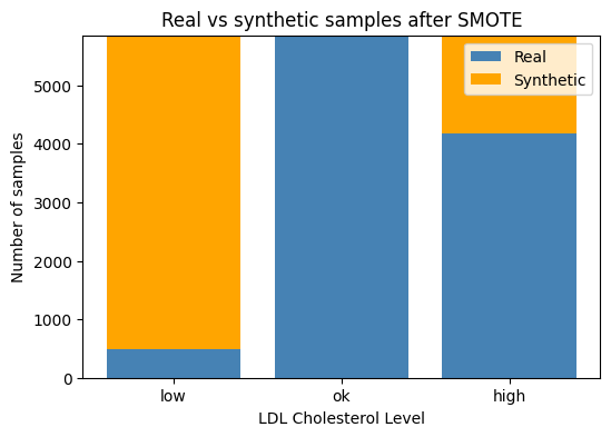
3.37 Building a preprocessing pipeline
We can save all our preprocessing steps in a pipeline — so we don’t have to apply each individual step again to our test data — our any future datasets that are of a similar format. We make use of the Pipeline class from Imbalanced Learn to do this:
from imblearn.pipeline import Pipeline

pipe = Pipeline(
    steps=[
        ("selector",  SelectFromModel(selector_est, threshold="mean")),
        ("scaler",    StandardScaler()),
        ("smote",     SMOTE(random_state=SEED)),
    ]
)
3.38 One Hot Encoding Labels for Deep Learning Model
The final pre-processing step is to one hot encode our target feature to be used in our deep learning model:
We one-hot encode the labels so the deep learning model can match each of its three output slots to a simple 0-or-1 target.
from sklearn.preprocessing import OneHotEncoder

ohe = OneHotEncoder(sparse_output=False)
y_train_ohe = ohe.fit_transform(y_train_bal.reshape(-1, 1))
y_test_ohe  = ohe.transform(y_test.reshape(-1, 1))
3.4 Building Our Deep Learning Model
Now that we have completed our pre-processing in section 3.3, it is time to build our Deep Learning model.
A deep-learning model is a multilayer neural network.
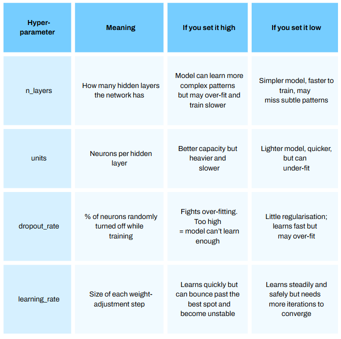
I plan to make a series just on deep learning soon, so please stay tuned! I will not dive too deeply in this model (pun maybe intended) for this article but will briefly touch on a few important hyperparameters [parts of the model we can configure — see Episode 12.1 How to Optimize Hyperparamters for Machine Learning Models]:
Programming this model from scratch is incredibly time consuming.
Thankfully, there are off the shelf libraries that enable us to implement this algorithm very quickly. For this project we use Google’s Tensorflow library.
For this first step we define a function we call build_model.
We do this as we want to vary our hyperparameters to find our best model — a process called hyperparameter optimization.
The diagram below illustrates the process for this using the Optuna library:
The code below implements the above 4 key steps. Comments have been added to each section to go in a bit more detail on certian components of each step:
from tensorflow.keras.models import Sequential
from tensorflow.keras.layers import Dense, Dropout
from tensorflow.keras.optimizers import Adam

def build_model(trial):

    ## a) Hyper-parameter sampling ##

    n_layers = trial.suggest_int('n_layers', 1, 4)  # Number of hidden layers, choose between 1 and 4 must be int
    dropout_rate = trial.suggest_float('dropout_rate', 0.0, 0.5)  # Dropout rate, choose between 0.0 and 0.5 can be float
    units = trial.suggest_categorical('units', [32, 64, 128, 256, 512])  # Units in each layer, choose one of the categeries in the list
    learning_rate = trial.suggest_float('learning_rate', 1e-5, 1e-1, log=True)  # Learning rate for Adam, between  1 × 10⁻⁵ and 1 × 10⁻¹


    ## b) Network assembly ##

    model = Sequential()

    # Add input layer snd hidden layer
    model.add(Dense(units=units, activation='relu', input_shape=(X_train_bal.shape[1],)))
    model.add(Dropout(dropout_rate))

    # Add n_layers more hidden layer/s
    for i in range(n_layers):
        model.add(Dense(units=units, activation='relu'))
        model.add(Dropout(dropout_rate))

    # Add output layer
    model.add(Dense(3, activation='softmax'))

    ## c) Compile model ##

    optimizer = Adam(learning_rate=learning_rate)
    model.compile(optimizer=optimizer, loss='categorical_crossentropy', metrics=['accuracy'])

    return model

## d) Train & return best val-accuracy ##

def objective(trial):

    model = build_model(trial)

    history = model.fit(X_train_bal, y_train_ohe, epochs=10, validation_split=0.1, verbose=0, batch_size=32)

    # Obtain the best validation accuracy from the training history
    best_accuracy = max(history.history['val_accuracy'])

    return best_accuracy


# Define sampler for reproducible results
sampler = optuna.samplers.TPESampler(seed = 21)


# Initialise a study using Optuna, set the number of trials to be 15 and
# identify which set of parameters result in the highest accuracy

study = optuna.create_study(direction='maximize', sampler=sampler)

study.optimize(objective, n_trials=10)
Running the above code results in a series of trials. For each trial a deep learning model is built with n_layers, units, dorpout and learning rate and the accuracy on the validation set is calculated. This can take quite some time to run!
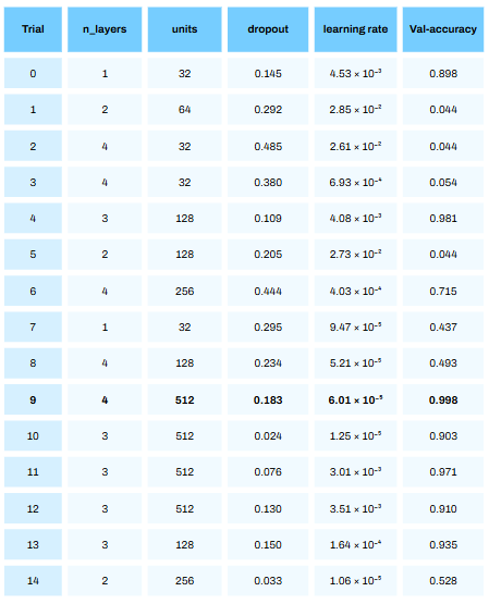
From the above table we see that trial 9 resulted in the best accuracy of 99.8%! Bare in mind — this was on the validation set (with some synthetic data) and not the test set. The performance on the test set will give us a better approximation of how this model will perform in reality (with no synthetic data).
It is quite crazy to see how much of a difference the hyperparameters we choose has on model performance. We ent from an accuracy of 4.4% in trial 1 to 99.8% in trial 9!
Also, it is not always the last iteration that will give the best hyperparameters!
The code uses Optuna’s TPESampler (Tree-structured Parzen Estimator). Without diving into this Estimator too deeply, it has has two phases:
Start-up phase — the first 10 trials by default are drawn uniformly at random within the ranges/lists we defined. (number of layers between 1 and 4 etc)
Guided phase — every trial after that is sampled by the TPE algorithm, which favours regions of the hyper-parameter space that looked promising in earlier trials (had higher accuracy scores)
We can see explicitly what hyperparameters resulted in the best model using the following code:
# Extract best hyperparameters
best_hyperparams = study.best_params
print("Best hyperparameters:", best_hyperparams)
From the above about we see that a deep learning model with 4 hidden layers, dropout rate of 0.18, 512 units and a learning rate of 6.01 resulted in the best performance!
Next we rebuild our model using the hyperparameters identified from the above process:
# Rebuild the model using the best hyperparameters

def best_model(best_hyperparams):

    model = Sequential()

    model.add(Dense(units=best_hyperparams['units'],
                    activation='relu', input_shape=(X_train_bal.shape[1],)))
    model.add(Dropout(best_hyperparams['dropout_rate']))

    for i in range(best_hyperparams['n_layers']):
        model.add(Dense(units = best_hyperparams['units'], activation='relu'))
        model.add(Dropout(best_hyperparams['dropout_rate']))

    model.add(Dense(3, activation='softmax'))

    optimizer = Adam(learning_rate=best_hyperparams['learning_rate'])
    model.compile(optimizer=optimizer,
                  loss='categorical_crossentropy',
                  metrics=['accuracy'])
    return model

best_model = best_model(best_hyperparams)
Next we train our model on the entire training set. We set the number of epochs (training iterations) to 15 to save time, however if you would like better model performance set this to a higher number.
# Train best model on entire training set - epochs set to 15 to save time (set higher for better performance but takes more time!)

best_model.fit(X_train_bal, y_train_ohe, epochs=15, validation_split=0.1, batch_size=32, verbose=2, callbacks=[tf.keras.callbacks.EarlyStopping(patience=8, restore_best_weights=True)])
3.5 Model Evaluation
After building our model it is important to see how well it performs on data it has never seen before (this is what we call the “test” set).
It is important we apply the same preprocessing steps we did on our training data, on our test data. Thankfully this has been done earlier in sections 3.31, 3.34 and 3.35.
That includes feature selection and standard scaling. We do not apply SMOTE as it is important that we do not add “synthetic” data that may not be reflective of real life. SMOTE was used to ensure the model does not bias to the majority class during the Training phase.
For this section we look at the Macro Average AUC score of our model and produce a confusion matrix. Both concepts are explained in a previous article here: Episode 10.3
Macro Average AUC, computes the AUC score for each class and takes the average. In this context, the AUC score of Low vs rest, AUC for Ok vs rest and AUC of High vs rest, and then takes the average AUC for each. This ensures that each category has equal weighting in the final valuation of model performance, quite important when you have a minority class and in a medical context.
import numpy as np, matplotlib.pyplot as plt, seaborn as sns
from sklearn.metrics import confusion_matrix, roc_auc_score, roc_curve
from sklearn.preprocessing import label_binarize

# Generate a set of probabilities for each class and select the class with the highest probability as the model prediction
y_prob = best_model.predict(X_test_scaled)
y_pred = np.argmax(y_prob, axis=1)

# Generate a confusion matrix
cm = confusion_matrix(y_test, y_pred)
class_names = ['low', 'ok', 'high']

plt.figure(figsize=(5,4))
sns.heatmap(cm, annot=True, fmt='d', cmap='Blues',
            xticklabels=class_names, yticklabels=class_names)
plt.xlabel('Predicted'); plt.ylabel('True'); plt.title('Confusion Matrix')
plt.tight_layout(); plt.show()

# Generate ROC-AUC curve for each class, and compute average Macro AUC score

class_names = ['low', 'ok', 'high']
plt.figure(figsize=(6,5))

for i, cname in enumerate(class_names):
    fpr_i, tpr_i, _ = roc_curve(y_test_ohe[:, i], y_prob[:, i])
    auc_i = roc_auc_score(y_test_ohe[:, i], y_prob[:, i])
    plt.plot(fpr_i, tpr_i, lw=1.8, label=f"{cname} (AUC = {auc_i:.3f})")


auc_macro = roc_auc_score(y_test_ohe, y_prob, average="macro")

plt.plot([0,1], [0,1], "k--", lw=0.7)
plt.xlabel("False-Positive Rate")
plt.ylabel("True-Positive Rate")
plt.title(f"ROC Curves — macro-average AUC = {auc_macro:.3f}")
plt.legend()
plt.grid(True)
plt.tight_layout()
plt.show()
The above output shows near perfect model performance on our test set! With just a single misclassification of predicting OK LDL Cholesterol for an individual that had High LDL Cholesterol. Pretty impressive stuff ayy?
3.6 Model Interpretation
We are not done yet! Now that we have built the model, it’s time to see how our model came to certain decisions. For this we use SHAP (SHapley Additive exPlanations).
Very briefly, SHAP (SHapley Additive exPlanations) breaks down each prediction into feature-level contributions. A positive SHAP value means that feature pushes the model’s probability up for that class and a negative value pushes it down.

In this project, plotting these values lets us see which wavelengths, humidity, or temperature readings are driving the model’s “low / ok / high” predictions:
# Extract samples of training data and test data (ideally you would use all training and test data but this can take quite some time to run!)
X_ref = X_train_scaled[:5000]
X_sample = X_test_scaled[:1000]

# Identify class names
class_names = ["low", "ok", "high"]

# Compute SHAP values per class
explainer = shap.DeepExplainer(best_model, X_ref)
shap_values = explainer.shap_values(X_sample)

shap_values_per_class = np.transpose(shap_values, (2, 0, 1))

# Produce a beeswarm plot for each class
for i in range(3):
    shap_class = shap_values_per_class[i]

    exp = shap.Explanation(
        values=shap_class,
        data=X_sample,
        feature_names=selected_features
    )

    shap.plots.beeswarm(exp, show=False)
    plt.title(f"SHAP summary – class '{class_names[i]}'")
    plt.tight_layout()
    plt.show()
The above beeswarm plots are, by default, ranked according to feature importance (average absolute SHAP value), with more important features in predicting the class at the top and less important at the bottom.
From the above plots we can make a few conclusions:
> Humidity and Temperature at the time of blood spectroscopy readings are the two most important features in predicting LDL Cholesterol levels.
> Absorbance values at 112, 117, 125, 3, 98 and 6 (each corresponding to different wave lengths of light) have strong predictive power for each level of LDL Cholesterol.
> We can see blue and red feature values on each side of the x= 0 line. This suggests that high or low feature values alone don’t consistently push our predictions of low, ok or high cholesterol in one direction.
In other words, a high reading of one variable can raise LDL in some samples but lower it in others. That happens when:
features interact with each other, or
the model has learned a non-linear pattern between our features and LDL Cholesterol levels
So no feature by itself has a simple “higher = higher LDL” or “lower = higher LDL” rule here.
4. Thoughts and Reflections
Looking back at this project there were a few areas that require elaboration.
Namely:
1. Model Selection
From the get go — it was decided to use a deep learning model. It is, however, a myth to think the more complex the model the better. Usually with more complex data, this is the case — however this comes at a big cost of interpretability which is key espeically in a medical context. Other models exist out there such as Mircrosoft’s LightGBM or Yandex’s Catboost that are known to preform extremely well on large datasets with many features. On reflection, I would try comparing the Deep Learning Model produced in this project with other such decision tree-based models.
2. Model Evaluation
When training the model, we looked to optimise accuracy. Since we balanced the dataset using SMOTE, in general this can be ok. However, there are other valuation metrics out there such as precision, recall or F1 score that can allow us to see our model’s performance from a different angle.
3. Model Interpretation
Lastly, the beeswarm plot produced in the final section of this project indicated interaction effects or a non-linear relationship between our features and target variables. To investgate this further, we could make use of SHAP dependence plots that can reveal some of the relationships in more detail. Explainable AI is an ever-growing field and I would like to dedicate more articles on this topic.